Am I getting fitter? A data scientist investigates
If you run quite often, and you record those runs with some kind of fitness tracker, you can build up a dataset of interesting data about yourself fairly quickly. But not a huge amount of interesting stuff seems to happen with that data most of the time. I use Strava, but I have found the tools they offer to track your fitness somewhat underwhelming, given the almost comical amount of data they must have about everyone's exercise habits.
But it's actually quite easy[1] to get your data out of Strava, and get it into a format where you can model it yourself. You could then, if so inclined, turn the output of that model into a little widget that will make predictions about your pace in different conditions:
| Distance | 10km | |
|---|---|---|
| Average Heart rate | 150bpm | |
| Temperature | 15 degrees | |
| Rest | 0 seconds/km | |
| Predicted pace | :/km | |
| Predicted moving time: | :: | |
This widget is predicting my own performance, based on my average fitness level this year. You could model the data any number of ways, but those predictions are coming from a linear model: we've got a small dataset – just 110 runs from this year – a small number of predictors, and we want something that's easy to interpret and check, but quick to build.
The Method
Before I thought of making a widget and sticking it into this page, my starting point was to work out if I've been getting fitter this year. I've been running a lot by my own standards, but I've also been exercising fewer hours overall than I have in previous years, when I was cycling a lot more. I've found it can be a bit tricky to work out whether you're getting fitter when you're doing different kinds of things – different distances, different paces, different weather.
My plan was to build a model to predict my pace on a given run. Pace seems like a sensible thing to target, because then we can easily bundle runs of different lengths and times together in our model. I didn't make any effort to build a time series model to estimate my fitness with any kind of parameter. The plan instead was to leave all information about the dates of the runs out of the model completely. We'll then plot the kinds of errors the model makes against the date of the run, and fit a curve to that. If I've gotten fitter over the year, the model – which will assume my fitness is the same all year – should overestimate my pace early in the year and underestimate it towards the end.
I have two advantages which probably makes modelling my own data easier than modelling that of the average runner. First of all, I live in London, so it's flat pretty much everywhere I go. Secondly, I tend to run at a fairly steady pace. I don't really do many intervals or sprints, and that should make my data easier to model, since I can focus on predicting my average pace.
We do, of course, need to decide what predictors to include in our model. I'm somewhat limited by the fields I have available in the Strava data, but I also don't want to use everything that's in the Strava dataset. I don't want to overfit, and I also want a simple model that's easy to understand and interpret, so I'm only including predictors that have both a decent sized effect and also a sensible intuition behind why they'd affect my pace. You can see from my little widget at the top of the page what I ended up using:
- Distance
- Average heart rate
- Temperature
- Amount of rest taken during the run
There are obviously lots of things I could have included, and perhaps the most interesting predictor I'm missing is something that captures fatigue. I definitely run slower when I'm tired, but after faffing around with various ways of including fatigue in model, I decided to just leave it out. I couldn't actually find much of a fatigue effect in the data, and I think the most likely reason is that there's outcome bias in the data – if I was very tired, I wouldn't run, so all the runs that would have been affected by fatigue are missing from the dataset. It could also be that my attempts to create a feature to capture fatigue weren't clever enough – that's really a whole separate modelling challenge in itself. Finally, my frequency of runs was pretty steady throughout the year, so it probably doesn't mess up our model too much if we just leave it out.
I played with a few different transformations of the data, since it seemed pretty likely that many of the predictors weren't linear. For example, the impact of temperature on performance surely isn't linear, the real negative impact must only kick in when you get towards hotter summer temperatures. I also tried some interaction terms between various different variables, but ultimately I left them all out. I ended up with seven predictors to try and predict my pace on any given run: distance, average heart rate, temperature, the square of those three things as separate predictors, and the amount of rest per kilometre. That "rest" value comes from the difference between elapsed time and moving time on Strava. The pace I'm predicting is the moving pace – i.e. the clock stops when I stop – so we want to predict a higher pace if I'm stopping for more breaks, but running with the same average heart rate.
Checking the model
There are two quick things we can do to sanity check if our model is working sensibly. First of all, we can plot what happens when we vary these predictors while keeping the others constant – for example, does the model think I should go slower when it gets very hot?
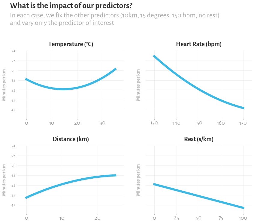
This seems mostly sensible: my average pace goes down when I run further, and my moving pace goes up when I pause for breaks. My pace goes up when my heart rate goes up – because heart rate here is really just a proxy for how hard I'm trying. I might quibble with what the model is saying about temperature. I do like the idea that the ideal temperature is a cool temperature, with performance worth both when it's hot and when it's cold. But I would probably have estimated the ideal temperature to be a bit lower, more like 8 to 10 degrees. It might be that because I've only trained the model on one year of data, the temperature could partly be a proxy for fitness – if I was less fit in the earlier, colder months, the model will overestimate the impact of temperature on performance. It's also possible there just aren't enough degrees of freedom here to properly capture the temperature effect. But I don't really want to allow the model more freedom, because the dataset is pretty small, and so it's very easy to overfit (I suppose this is why I settled on using the square of some of these variables as a predictors, that allows a bit of freedom to fit non-linear relationships, but not enough freedom that it can horribly overfit).
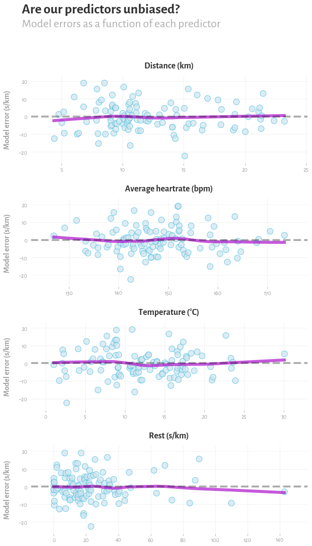
To sanity check that our predictors and their transformations provide a reasonable fit to the data, we can also look at a plot of the residuals for each predictor. We're basically just asking the model to predict what pace I would have on each run, using what it's learned from the other runs, and seeing how that compares to my actual pace on that day. We want to check that these predictors are unbiased – by which I mean that by knowing this predictor alone, you couldn't predict whether the model was going to make a mistake or not. I've added a lowess trendline to the plot, and ideally I think we'd like to see a horizontal straight line, with the distribution of errors around that line somewhere close to Gaussian.
The results
To test whether I actually got fitter, we'd going to plot the errors of the model again, but this time with the date of the run on the horizontal axis. The errors are in the predicted pace, in seconds per kilometre. A positive error means I was slower than the linear model expected, and a negative error means that I was faster. Note that this is all in-sample – but you know, it's just for fun. We then fit a lowess trendline to those errors, which should give us a curve estimating how my fitness has changed over the year.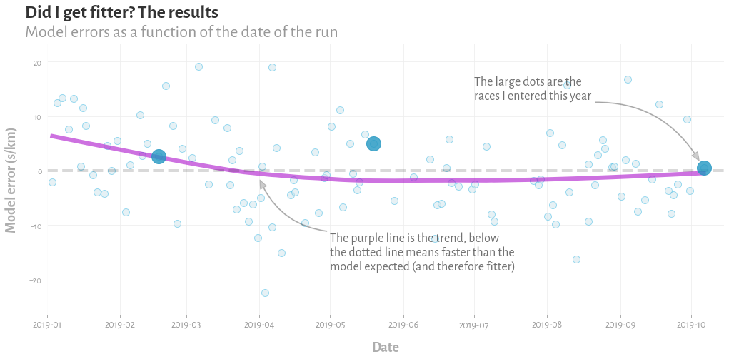
So what is the model telling us? The apparent conclusion is that my fitness has mostly stayed the same over the year – a slightly underwhelming conclusion when you've spent an afternoon building a model, but not an implausible one.
I've highlighted three predictions that the model made, which are for the three races I did this year, three half marathons. For further evidence that my fitness was pretty constant, I actually ended up running the same time in all three: 1h34m. The model implies my fitness may have been best in the last spring, and that I actually underperformed a bit at the Hackney Half Marathon in May. This too seems plausible, because I was fairly confident I could duck under 1h30m for that race, but not a whole lot about it went right: I had a family party 200 miles away the night before, had to rush back to London in the early hours and only had a few hours sleep, and then in the race I went out too hard and blew up. To be honest, given how badly the second half of that race went, and how bad I felt, it's kind of amazing I got the time I did.
So there we have it: we've brought the tools of data science to a real world question: did I get fitter this year? And we've got on answer: "Not really, maybe a bit in the middle, but you basically stayed the same all year, you know, if you trust the model". Perhaps, in a way, that's a glimpse into the reality of data science in practice: we are presented with a modelling problem which we could approach in a hundred ways, but we use a linear model because it's quick to build and easy to understand. We then carefully check our input data, validate our model, and ... end up with a conclusion that's a bit less exciting that what we were hoping for. But at least we got to write a blog post, make a little widget, and churn out some pretty little graphs, and let's be honest, that was probably the real goal all along.
- I found a useful tool at flink.run that lets you download your data in a friendly format, and even includes some weather information in the dataset.